Create print-ready tables showing frequencies (for categorical variables) and descriptive statistics (for numerical ones) and produce plot matrices useful for exploring the distribution of, and basic relationships between, different variables in a dataset.
A necessary first step of almost any data analysis is to get familiar with the data through basic descriptive statistics and visualizations. In this post, I share a basic workflow that I tend to use when I start to explore a new set of data.
As an example we'll use the starwars data in the dplyr package, which contains information on the characters from all seven Star Wars movies.
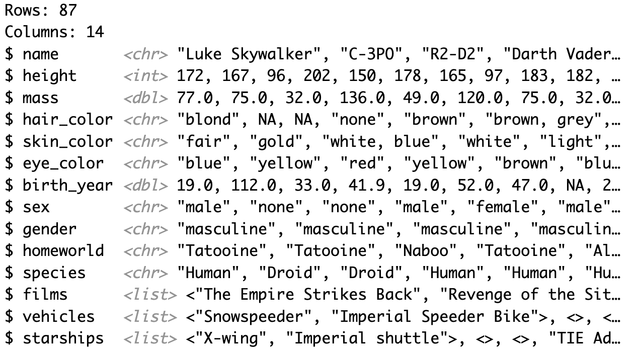
# Load library and datalibrary(tidyverse)data(starwars)# View dataset contentsglimpse(starwars)
As we can see, this dataset contains information on 14 variables (Columns) about 87 Star Wars characters (Rows), including categorical factors such as gender and species, as well as numerical variables such as height, mass, and birth year.
Summarise categorical variables
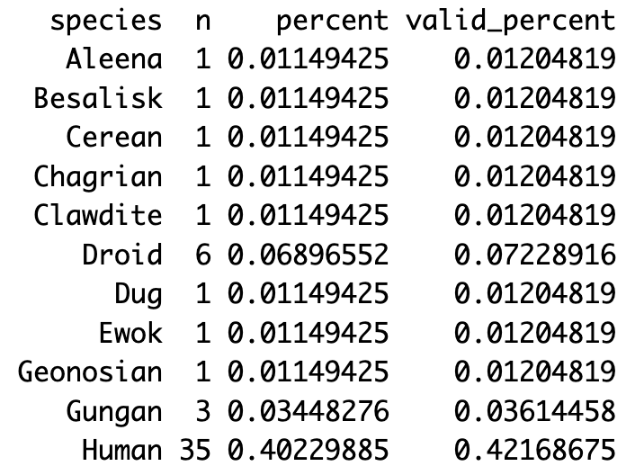
For category counts, I like to use tabyl( ) from the janitor package, which provides frequency tables that are highly customizable and tie in well with other tidyverse functions. To look at just one variable, we can create a simple one-way frequency table:
The output table lists all 37 different species in the dataset, how often each of them occur, and their frequency as part of the total count (including NAs) and valid count (excluding NAs). As you can see, most species only include one character. With 35 and 6 characters each, Humans and Droids are the most frequently appearing species — so I'll focus on those in the following.
You may also wonder about the gender of the characters in this dataset, and whether the gender distribution is similar across Humans and Droids. Let's look at this using a two-way frequency table:
two_way<-starwars%>%# include only Humans and Droidsfilter(species%in%c("Human","Droid"))%>%tabyl(species,gender)%>%adorn_totals("row")%>%# bottom row with total countsadorn_percentages("row")%>%# proportions by rowadorn_pct_formatting(digits=0)%>%# round to whole numberadorn_ns()%>%# include raw countsadorn_title("combined")# include both var names in first celltwo_way
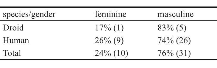
While tabyl() alone produces as simple cross tabulation, I have used a series of adorn_( ) functions in this example to add more useful features to my two-way table, which ends up looking like this:
Now, since tabyl ( ) is based on tidyverse functions, we can pass on the output to the kbl ( ) function from the kableExtra package to produce an HTML table formatted for print, that we can copy from the R-Study Viewer directly into a Word document.
library(kableExtra)two_way%>%kbl()%>%# apply print theme and font formattingkable_classic(html_font="Times New Roman",font_size=12)
Perhaps unsurprisingly, the vast majority of Human and Droid Star Wars characters are male (76%), although the distribution is even more skewed among Droids than Humans (83% vs. 74%). I'll leave it up to you how you want to interpret that information 😉
Summarise numerical variables
For summarizing numerical variables, I tend to use the describe( ) function from the psych package. This gives a good range of descriptive statistics, but I manually add columns for the lower and upper bounds of the 95% confidence interval around the mean and the number of missing values (NAs), since those are usually required in publications in my field.
library(psych)descr<-starwars%>%describe()%>%# turn into tibble for further formattingas_tibble(# add column with rownames (= variable names)rownames="varname")%>%select(-vars)%>%# count NAs mutate(missing=nrow(starwars)-n,.after=n)%>%# calculate 95% CI around meanmutate(CImin=mean-(1.96*se),CImax=mean+(1.96%se),.after=mean)descr
Now we have a nice data frame with our descriptive statistics:
As before, the kbl( ) function is a useful way to turn this data frame into a formatted table ready to be copy-pasted into your main document. These are the steps I normally go through to produce a table compliant with publication guidelines in my field:
descr%>%# select and order summary statsselect(varname,n,missing,min,max,mean,CImin,CImax,sd,skew,kurtosis)%>%# change row namesmutate(varname=factor(varname,# current nameslevels=c("height","mass","birth_year"),# names in printlabels=c("Height","Weight","Birth Year")))%>%kbl(digits=2,# round to two decimals# change column namescol.names=c("Variable","n","NA","min","max","mean","CImin","CImax","sd","skewn.","kurt."))%>%# apply print theme and font formattingkable_classic(html_font="Times New Roman",font_size=12)
As indicated by the skewness and kurtosis values, height seems to be roughly normally distributed, but something weird is going on with Weight and Birth Year. Visualizations are a good way to figure out what might be happening here.
Visualise data
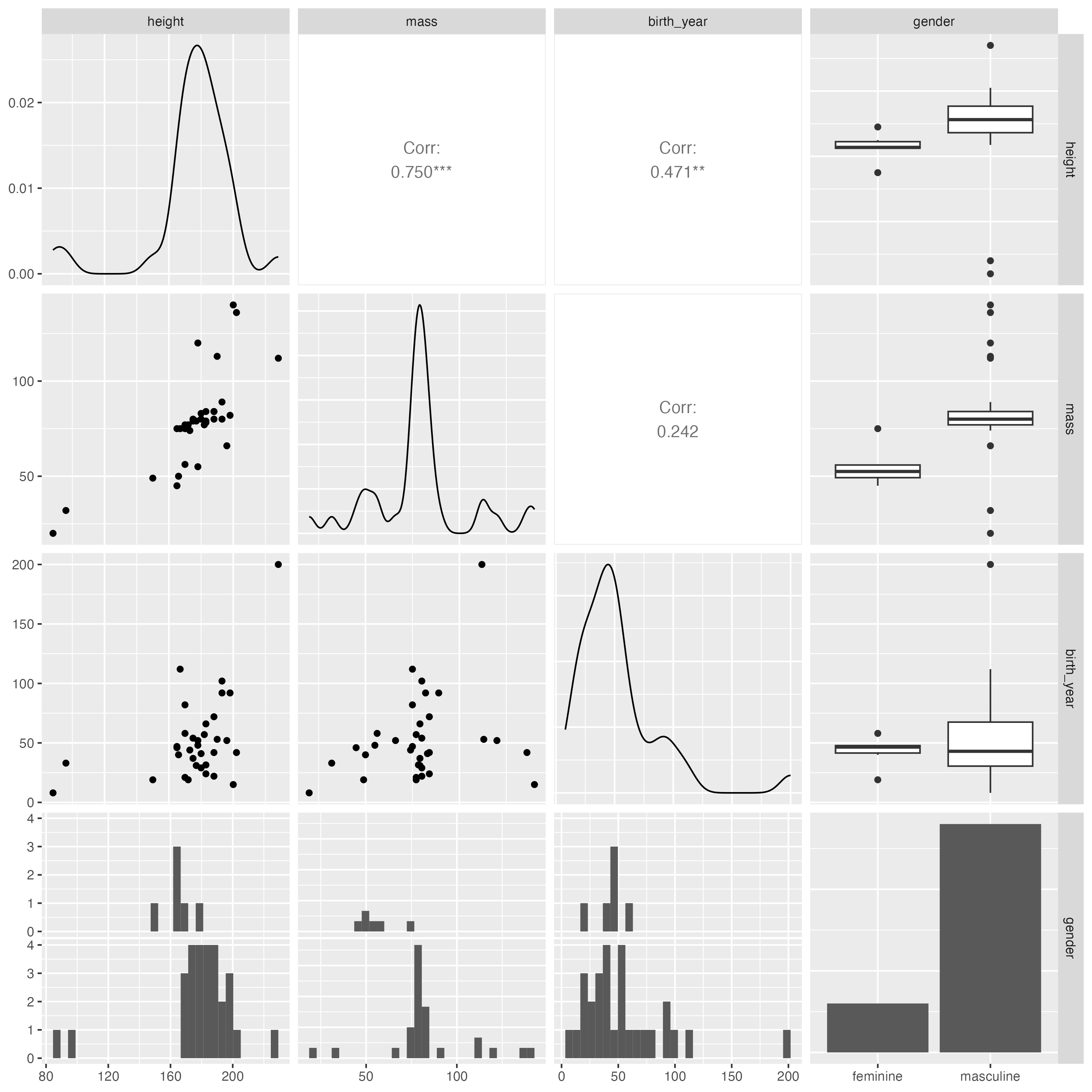
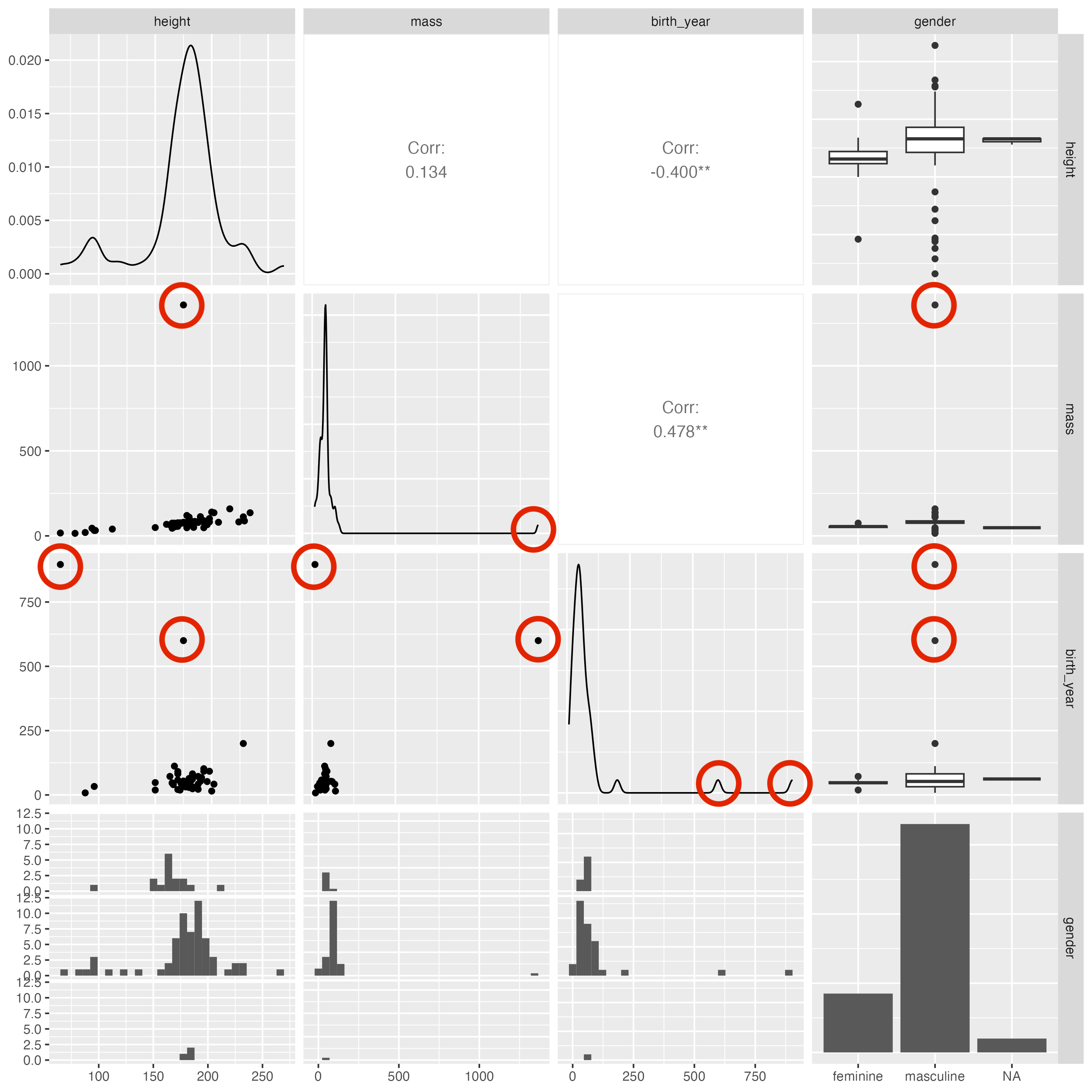
Instead of plotting each variable separately, I like to use the ggpairs( ) function from the GGally package [equivalent to pairs( ) from baseR] to produce plot matrices that are useful for exploring the distribution of, and basic relationships between different variables in a dataset.
Since the plot will become difficult to read the more variables we include, we'll just focus on some we've already looked at. I excluded the species variable here, because ggpairs( ) by default will not plot variables with more than 15 categories.
On the diagonal of this matrix, we can see the distribution of each individual variable (density curves for numerical and histograms for categorical factors), and different aspects of their relationships with each other are shown above and below. For two categorical variables, the lower panels show scatter plots by default and the upper panels contain the Pearson correlation value and significance. For categorical-continuous pairs, the lower panels display histograms and the upper panels contain box plots.
As I've highlighted above, these visualizations make it very easy to understand the way in which the mass and birth_year data are non-normally distributed: Both variables contain outliers at the very upper end of the value range. If we remove these, we can see that mass and birth_year are now somewhat more normally distributed, and both show significant correlations with height (but not with each other).
Of course there are many more ways to get familiar with a new dataset, but I wanted to show you some of the most basic steps that I go through today. In my next post, I will show you my preferred way to visualize the distribution of numerical variables.